

Esterbrook x FWP Estie Nebulous Plume <EF> – $395USD (Esterbrook Pens)
Currently Inked: Robert Oster ‘Fire & Ice’
Esterbrook Estie Raven <Uranagi specialty grind> – $225USD (Esterbrook Pens)
Currently Inked: Kakimori ‘Koton’
We’re back with another review in 2024! Another twinning set that I have been quite excited to share about and review. I picked up the Esterbrook x FWP collab Estie pen on release and was even lucky enough to get on an early shipping batch – my pen showed up within 2 days of ordering! I will say, I deliberated for about 48h before finally deciding on it. The decision wasn’t because I didn’t know whether I wanted the pen or not, it was simply just a cost factor. I will touch more on this in my ‘value’ section later. The Raven had a bit more of a fun story behind it and was also a relatively easy decision that I had about 24h to think about. I happened to hear that Matthew from Matthew’s Nib Works was in town stationed at Wonder Pens in Toronto during the Toronto Pen Show weekend. I was excited because I had been meaning to have my montblanc tuned (for its baby bottom) and this was a chance to book a time slot without the rush and flurry of pen show madness. Knowing the Raven came out around that week as well, I had decided pre-emptively that if Wonder pens had one in stock, I would use that towards my first-ever custom grind experience!
So here we are, many months later and ready to chat about the Esterbrook Estie, a pen that I have been seeing crop up more and more on my pen feeds and a pen I knew I had to try eventually. Let’s get to it!

Look
Does this pen look super awesome? The Nebulous is stunningly beautiful, the Raven is cunningly stealthy. Both are wonderful.


The Esterbrook Estie has been on my radar for a while and of course I had to kick start my experience with a collaboration model. I was curious why the pen was so popular and I think it’s a combination of reasonably affordable well made pen as well as a special spring cap system that keeps the nib wet. More on that later!
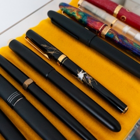
I’ll start with the Raven, because it’s ‘simpler’. It features the standard torpedo-esque shape of the Estie model in a beautiful matte black finish with black trim accents. I have found that the matte surface, while beautiful, tends to get scuffed quite easily. I’ve been keeping it in a pen sleeve (rickshaws seem to be the only ones that don’t scratch) to avoid having to rub out the scuffs every time I take the pen out. Other than that, I love the ‘all black everything’ look and have had this pen perma-inked since purchase for my doodle planner.

The Nebulous Plume, oh wow. I suppose that’s expected, it is a rainbow-coloured resin blank complete with sparkly bits. My particular pen has more swathes of indigo purple and cyan blue with smaller patches of red and orange. I have seen some fairly ‘brown’ looking mixes so I’m pretty happy with my score of a blank. The distinction of the FWP collaboration Estie vs the typical model is the metal ring just below the cap. It looks like a cast metal feature with the FWP name. I have heard mixed feelings about this, but I quite like it. It calls attention to the uniqueness of this collaboration. Other than that, the Estie model is fairly clean and minimalist with the Esterbrook logo etched neatly at the edge of the cap and a simple gold clip. Finally, the grip features the same rainbow resin and the nib is gold-coloured steel with the FWP logo etched on instead of the Esterbrook logo on the Raven.


Esterbrook packaging is quite nice, but throw in the FWP collaboration and you’re asking for a complete upgrade. The Raven comes in a standard magnet cover canvas cloth box. Nothing too fancy but it’s a solid box and I quite like the canvas texture. The Nebulous comes in a pleather case complete with a separate section for the small 20mL ink that comes with the pen. I have several of these little bottles now and they’re very cute, but I wasn’t in love with the ink colour, hence a different matching ink selection.

Esterbrook pens use a #6 Jowo nib, so there’s not too much to say about them. They look classic and simple with nothing too boring or exciting. They work excellently as expected, which is a great lead into our next section.
Feel

These pens are starting to inch their way up on my everyday use favs. Like I mentioned, I’ve had the Raven inked since day 1 and keep it inked with my waterproof black ink for daily doodles in my planner. Jowo nibs are solid, they just work. They’re reliable and easy enough to take apart for cleaning. I picked an EF nib for Nebulous and I believe it is tuned in advance so I have had no issues with it so far. The Esterbrook stock nib appears to be tuned smooth so it was a great writer out of the box with no skips or hard starts. The cap ensures it doesn’t dry out easily and even uncapped for a long while I didn’t have any problems getting it to go again.

Now for the Raven – my first specialty nib grind! I actually bought the B nib since that’s all that was left in the store. But if you know anything about my preferences, I am an EF nib enjoyer because of the doodling, so I asked Matthew if he had something he could do to the nib without it feeling like a waste to take out all that ‘broad-ness’. He suggested a Nagahara grind, which allows for a needlepoint regular use and a thicker reverse nib for vast line variation. It’s been very fun to use and I love using it for my doodles. Again, smooth from the start and no issues with the doodle experience!
Now for the only part of the pen that I’m on the fence about, the cap. The design and the system is great, don’t get me wrong. I think it just took me a while to get used to squishing the pen down before turning. I have to be more conscious of re-capping the pen and sometimes if the pen doesn’t nicely align with the inner spring inside, it catches and I have to readjust. Now I’m not saying I don’t like it, because I quite admire that Esterbrook is one of few manufacturers at this tier of pen to include a system like this that keeps pens from drying out. It’s hard not to compare to the Platinum Century 3776 cap experience that doesn’t require a push-then-twist motion, just a satisfying compress towards the end of the twist that lets you know your cap is tight.


I have enjoyed using these pens regularly. They’re easy to pick up, uncap and use with their reliable nibs. The balance is decent for my grip and writing style though not perfect. The reason I say the pen isn’t quite perfect for me is because it’s a bit larger in size, both in length and grip diameter, so I tend to get a bit fatigued if I use the pen for too long. That doesn’t really stop me from gravitating to the Nebulous because the smooth nib is quite enjoyable and I found I got used to the unusual cap quite quickly.
A couple comparisons below of some gold-hardware pens. From left to right: Platinum Kanazawa Leaf Maki-e, FWP Brush Pen, Esterbrook Estie Raven, Esterbrook Estie x FWP Nebulous Plume, Pelikan M200 Golden Beryl, Navalur Nautilis Brilliant Bunny.


Value
I have mixed feelings about value for this pen. I’ve heard many reviews, comments and remarks that it’s hard to justify the price for the Estie – over 200 for a steel nib pen. Not only that, the FWP collaboration was over double the regular price of an Estie. This was partly from the elevated ‘luxury’ tag of the FWP collab as well as the extra bottle of ink/metal hardware on the pen. The Raven also had a slightly higher pricetag than the standard Estie, perhaps because of the all black aesthetic and a couple other unique factors on the pen. As with many reviews before, value is on the fence. Am I happy I got these two pens, certainly! Would I have fomo if I didn’t end up getting them, maybe a tad, but not entirely. My collection is already quite vast and plentiful, and lately I’ve been feeling more of an affinity for gold nibs ^_^;;

What I will say though, is these pens are well-made and reliable. They don’t feel like they’re made of cheap materials and there is a lot of care in the design despite the minimalistic look. I would say they’re slightly above the custom-turned pen range for me and there is an allure of quality in the production, packaging and professionalism in Esterbrook that you may not get elsewhere.
Conclusion
Pros
- Reliable jowo nib – good ink flow and pre-tuned smooth nib
- Good quality resin material and nice attention to detail
- FWP Nebulous is a very beautiful rainbow blank
- Raven is just what I want in my all black everything collection
- Jowo collar compatability means potential for customization and nib swapping
Cons
- Newer models and collab models tend to be a lot higher in price
- Cap system is great for keeping pens from drying but takes some getting used to
Ink
I was weary to use the Nebulous Blue ink that came with the Nebulous pen because it didn’t speak to me like the pen did. It just wasn’t as fascinating as I expected and felt like I could make a cooler pairing for the pen for the review. I think a fiery orange would be neat, but I settled on Robert Oster’s Fire & Ice. It’s just got that extra oomph of uniqueness to pair with the pen. Raven gets black – duh. And I went with my waterproof kakimori black because it’s a wonderful ink that I’ve had no issue with when watercolouring over! What other inks would you pair with these pens?
Thanks for reading! Of course it took me being sick to finally have a day stuck at home to finish my pen review. I’m in better spirits since recovery is on the up and I finally got this review out. Next up will be prepping for my bloggiversary this month – I don’t know what to do yet, but will it involve acquiring a pen? Who knows. Stay tuned and as always, stay cheerio 🙂


I love the aesthetic of the Nebulous Plume. I think I obsessed over it for a long while, but luckily (or unluckily) I don’t have the funds for this pen, and I definitely didn’t have enough brain power to re-arrange finances to squeeze this one in. Esterbook Estie pens in general are a pen design I’d love to have. It really fits in my preferred look (and the resins are stunning!). I’m ever so grateful that a friend gifted me her Leonardo Fuore that looks like the Estie, otherwise I’d still be lacking this particular design shape. But I still secretly harbour a love for the gold trim on the nebulous plume…
LikeLiked by 1 person
It may not happen in the near future or ever, but if I ever find in my heart I might want to let it go I know who to reach out to first xD
Thanks for reading! It’s a nice pen to try but can’t really go wrong with that Leonardo you got there already 🙂
LikeLiked by 1 person
I would love to try an Estie but I haven’t found one that has inspired me to rearrange my budget. Nebulous Plume came very close because that blank is absolutely gorgeous but I find the gold band quite ostentatious and by the time I had finished debating with myself if that was a make or break, it was out of stock. Such is life! Thank you for the review!
LikeLike