

3952 Abalone Shell Fountain Pen
Rose gold plated EF bock nib
$130USD – Pen Chalet (here)
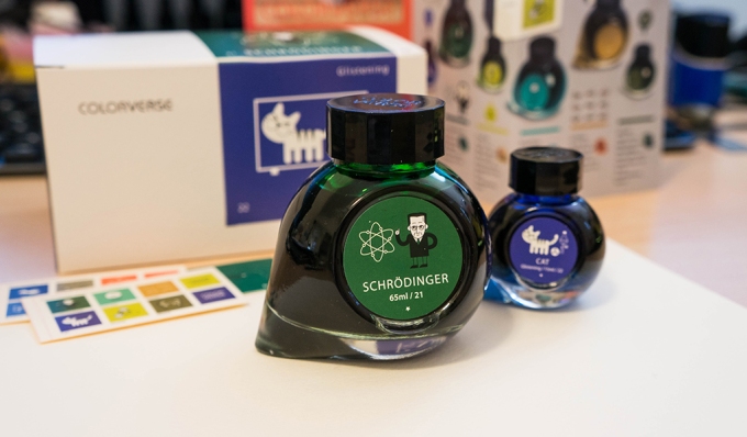
Currently Inked: Colorverse Schrodinger – Series 3, Multiverse – $36 (here)
New pen! New Ink! You may remember I went and bought myself a new pen almost right after saying I was done for the year. And then I went and got new ink too. So here I am, having spent some time with my new things, and ready to talk about them! This is a Taiwanese brand, 3952, I have not heard of outside of the major brands of fountain pens I am used to hearing/reading about — pilot, sailor, platinum, lamy, pelikan, etc… I found the pen initially from reading some reviews and immediately knew this would be a pen for me. Whether it would write and draw well, and serve as a daily use for me was yet to be seen, but novelty-wise, it’s checked all the boxes. Let’s take a look, shall weeeee?

Look
Does this pen look super awesome? Yessaa
This is a pen made of some magical copper/bronze-ish/rose-gold-ish coloured metal with a barrel made of real abalone shell. The abalone shell is not exposed, but protected in a clear acrylic barrel. The abalone shell is pearlescent and, for lack of better words, also magical. Every pen is different, since every abalone shell is different, which adds to the unique factor. I like special things. The pen company has opted for a German branded (?) Bock nib, but special as well, in that it is plated in rose gold. The nib looks excellent to match the theme of the rest of the pen. I picked up an EF, which, after using it for a few weeks can safely say it’s a nice Japanese Fine.

On top of all these special factors, the pen cap is also engraved with what I’d call a sort of shell cross hatch pattern. I’ve read that some people aren’t too into this design choice, but I actually like it quite a lot. Plays with the sea-theme if anything. It also adds a nice detail. The clip of the pen and the edge both have the company’s name 3952 etched on in different fonts — not sure why. The finial is kinda funny looking, but acts as a bit of a spring for the clip. Not entirely sure how I feel about this design decision, but functionality wise, it works well. I don’t have any trouble clipping and unclipping the pen on things.
Perhaps the only gripe I might have with the overall look of the pen, is the small-ish looking grip section right above some hefty looking cap threads. It’s not a terrible aesthetic, but the small section looks like it might make gripping a little uncomfortable (more on that below), as well as an imbalance with such thick looking threads. Maybe one redeeming idea is the repeat of the threads at the end of the pen, to allow the cap to attach securely to the end. Overall though, I don’t mind the thick threads, and perhaps the shorter section is a result of having more abalone shell in the barrel…so I can’t be too unhappy with that right?

Packaging wise, the pen comes in quite a large box with a paper sleeve. It’s not anything fancy, but the packaging is a little excessive imo. Such a large box for a single pen and converter and not even any brochures or papers. Not that I would want that. I think now that I’ve accumulated so many box packages for my previous pens, I actually really appreciate simple and easy to recycle packaging. I have yet to throw out a pen box yet, but when I start (which I assume I will), I know I’ll appreciate those the most.

Feel
Well for starters, this is not a feather light pen. It’s made of some kind of metal that feels pretty hefty. This isn’t the heaviest metal pen I own, I’d say the brass Tactile Turn is probably the heftiest still. But heft aside, this pen has been wonderful to use. Over the past few weeks, I’ve picked it up for journalling and doodling and every time it has performed pretty well. I tend to use it for maybe 10-30 min at a time, so by the 30 min mark my hand does get tired, but for just 10 min it’s not too bad. I may have mentioned it earlier, but the grip section of the pen is quite small. Even with my smaller hands and small fingertips, I find I am just at the brim of too big for this grip. My fingers will shift and start touching the main abalone body

The EF nib is pretty nice too. It produces a smooth and thin line as expected, with a medium amount of ink flow and extremely consistent. I have found though, that for longer use periods, the pen would ‘dry-out’, and I’d have to push the ink forward in the converter to get it juicy and flowing again. Not extremely convenient, since every now and then I have to unscrew the pen apart to fix this. It’s not like the ink isn’t flowing at all though, it’s just thinned out. I’m not really sure what to make of this though, since otherwise, the nib is very smooth and consistent, and definitely doesn’t skip. Also I found that I can leave the pen uncapped for a little while and it will still write as if just uncapped. That’s a good sign!

The nib isn’t scratchy but it isn’t buttery smooth either. There is some resistance/friction, but because the ink flow is so consistent, the overall experience of using the pen has been positive. I’m not sure I have any complaints about it, but I can’t say I have anything to rave about it either. So if anything, I have concluded that this is a solid pen with a great look, and doesn’t provide a poor experience, which brings it an overall above average evaluation from me.
I decided to draw something related, thematically, to the fact that abalone is from the sea. I doodled a mass of sea-ish things, and because the pen was enjoyable to use, the doodle was fun to produce too.

Back to the weight, I mentioned before that you can screw on the cap to the end to ‘post’ the pen. Being a metal pen, posting the pen just makes it even heavier than it already is. But I will say the pen is still surprisingly usable from a practical standpoint. It is still definitely back heavy, but somehow it doesn’t feel like it weighs back THAT much. Perhaps it’s the slim profile of the pen, or some magic weight balancing act that’s been designed into it. Then again, posting the pen by screwing it on the back instead of capping it at the back ends up making the pen super long. It’s a weird balance.


Value
So there it is, why did I know this pen was for me? Well it was primarily by looks and unique-ness factor. Here’s a pen that uses some special rare sea creature’s shells with a decent design, colour scheme and uses a nib brand (with custom rose-gold colour!) that I have tried and know to be consistent and reliable. And early reviews said it didn’t have any issues with writing either. So why not?
The price point is obviously on the high end (relatively), but for how much I’ve used it so far, and project myself using it, I think it’s fair to say it was worth buying. However, unlike some of the other staple pens I’ve reviewed in the past, I wouldn’t recommend this pen for everyone. You’ll have to weigh the list yourself to see if what the pen offers is suitable for you.

Conclusion
Pros/
- Unique and beautiful real abalone shell barrel
- Nice shell cross hatch pattern etched on the pen cap
- Not too many rotations to uncap the pen
- Weighty and classy
- Smooth writing and reliable steel Bock nib, EF is nice
- Sturdy and solid pen that can withstand some rough use
Cons/
- Weighty
- Posting the pen leaves it extremely long
- The ink flow is great until it seems to run dry, then needs a push from the converter to keep rolling
Ink
New pen…with new ink! What do we have here? This ink has been all over fountain pen and ink blogs for the past while — a new Korea-based ink brand that’s released three series of inks so far, a company called Colorverse. All the inks they make are science-y or space themed. The most unique feature of the ink would definitely be the teardrop-esque bottles and the fact that each purchase comes with a tiny little miniature of the main large bottle. The latest series, which I have here — Schrodinger and Cat, consists of two different inks while the previous two series contained a literal mini version of the same ink of purchase.

I picked this super super green ink for two reasons. One, because I really wanted the glistening Cat mini bottle, which could only be acquired by buying the set. And second, because I recently bought myself a Slytherin themed official Harry Potter merchandise notebook. And the green matches perfectly. I’m not going to review the notebook, because it’s nothing really special, the paper is average (though still fountain pen friendly), and it’s not THE greatest quality of notebooks –when I have things like the Baron Fig to compare to, haha. But nevertheless it contributed to my first ink colour choice among the multiverse (harhar) of choices in the three series.
The ink pamphlet that comes in the packaging says:
Schrodinger
RGB: 8, 109, 56
pantone colour: 2258U
surface tension of 64
PH of 7.2.
Does this mean much to me? Honestly, not really. Not even the RGB or pantone number. But it’s very nice of them to include this information for all of their inks. I feel like if one day I have too many shades of the same type of ink, I may care a little more about the colour values, but for now, I’m content with just knowing what kind of green I have. The fact that they offer information on the surface and tension and PH value is very interesting, and while I don’t know what exactly it means relative to how it runs through a pen nib or how it is affected on fountain pen friendly paper, I’m sure this type of information comes as some value to many other people.
The packaging is by far the best I’ve seen, though on the excessive side, as I find I have very little use for all the misc. papers and things that come with it. I like the stickers though, of their collection. I need to find a home for these.
So here’s the header image again, in my passion planner paper (my new review book!), looking dashingly envious. I like that the ink has some shading but nothing too variant. It’s not quite a perfect match for my abalone pen, but I have enjoyed using it so far, especially in my Slytherin notebook. 🙂
Thanks for tuning in, as always, and stay tuned for whatever’s brewing next!


A great review. I always enjoy your writing and illustrations.
LikeLiked by 2 people
Nice review, and I always admire your work! The pen’s not quite my style, but it compliments and is complemented by that ink beautifully. What a great combination.
LikeLiked by 1 person
Thank you! Yep, definitely not a for-everyone kind of pen!
LikeLiked by 1 person
1.3 oz, that is pretty hefty for a small pen like this!
LikeLiked by 1 person
The ink starvation problem may simply be due to the ink staying at the back end of the converter; if so a simple remedy is to give the pen a gentle shake with nib facing down. Try this with barrel removed at first. Or a converter with an agitator inside the reservoir may help.
LikeLiked by 1 person
thank you! Yeah I will give that a try, I did notice that the ink does seem to just stay at the back end of the converter when i unscrew the barrel out
LikeLiked by 1 person